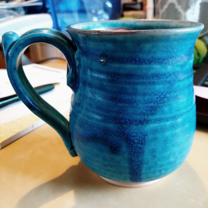
and mug the second

And here's the second mug, coming from the spring 2015 session of my pottery class.

This one is a much frostier green, but still has a bit of a sheen to it, and isn't pure matte.  This one also pools blue because SHOCKER I choose green and blue glaze combos. 

This is another runny but really pretty combo: standard pottery pale seaweed, topped with a dip of moss.  Moss is a semi-matte, almost like velvet, and pale seaweed is a pale frosty matte mint that can puddle bright blue and glossy.  Together the chemistry turns them into this combo, which I find lovely.  

please to note, you can also see where I whacked the mug off kilter where I attached the handle.  Oops.

Again, you can't quite see the blue puddle in the bottom, but trust, it's there. 

This is another mug where I purposefully created a glaze catch while trimming the foot, just to give the glaze runs a place to pool and collect and (hopefully) not run all the way down the foot and fuse the bugger to the shelf. 

A wee tumbler

remember what I said about shrinkage with clay? Well this one I knew was going to be wee. 

a tiny tumbler. Probably good for bourbon, right?

I normally lean toward pieces with feet, glazed in something with a bit of blue, and this piece has neither. I am pleased with the balance, both shape and weight wise, but also with the glaze.

ok maybe a little bit of blue

The first dip of glaze is cream, which is a soft semi matte, with a bit of a velvety hand to it. Interestingly it broke a bit reddish brown (shino-y) where it was heavy. Then I dipped the room in moss, which alone is a complex brown-green semi matte. Through the magic of chemistry, not only did the overlap come out glossy and somewhat translucent, but it ran a frosty baby blue at the lightest application.  

Glaze is not like paint where red and blue pigments make purple. The components of glaze change chemically in the kiln as they melt and attach themselves to the clay body, and when you combine two glazes they interact with each other as well. Even there color of the glaze when dipped doesn't necessarily correlate to the color when fired. So instead of red plus blue equals purple, it's more like bathtub plus lunchbox equals telephone. 

the inside. Totally bourbon, right?

I love this mug.

did you notice I cropped out the unholy mess behind the mug? Mostly, I mean. 

did you notice I cropped out the unholy mess behind the mug? Mostly, I mean. 

It's not one of mine, but it's one I'm striving towards creating in terms of design.  It's from Scargo Pottery, a fantastic place on Cape Cod in Brewster, MA.  They have several amazing potters creating there, and we go to visit it every year. (last summer we saw a raku firing there. SO COOL.)  And every year, we come home with more mugs.  All of which are lovely, but there are some I love more than others.  Like this one.

It also holds a shitton of coffee, bless. 

Scargo Pottery 30 Dr. Lords Road, S, Dennis, MA 02638.  And they're open year round, not just seasonally.